Have you ever bought something and never wore it again?
Need a stylish
clothing for that special event?
This is my story of designing
ShareDrobe - A prototype for iOS app that lets people rent clothes for a
fraction of the price.
I led the design of ShareDrobe for iOS since the outset of the project in July 2017. ShareDrobe was conceptualized during my time at UCSD’s usability & information architecture course in the Summer of 2017. The class held no specific themes, but students were encouraged to ideate solutions that impacted our age group because the user testing would be performed on other classmates. I worked in a team of 8 and used human centered design techniques to construct our solution into an app based prototype.
I created frameworks and prototypes to share the vision, design principle and content strategy. This helped to evangelise ideas, gain alignment and drive decision making.
I designed down on iOS mobile platform. I executed journeys, wireframes, prototype, and design specs.
I designed up, assign tasks to team members to improve effectiveness, improve coordination, and increase efficiency.
There are many instances where customers would buy a piece of clothing
and would never wear them again. Events such as halloween, school
graduation and many others forcing our users to buy one particular
set of clothing and would never wear it again.
Our challange was to figure out a way where clothes can be
shared with other people where it can benefit both parties.
ShareDrobe offers an experience where user can choose from a
collection of clothes that they want or need without having to spend
a full price of the clothes.
Our three main competitors are Le Tote, Rent the Runway, and Mr. Mrs. Collection. Le Tote and Mr. Mrs. Collection were very similar in that they were both subscription based services where the users don’t get to choose the clothes they rent.
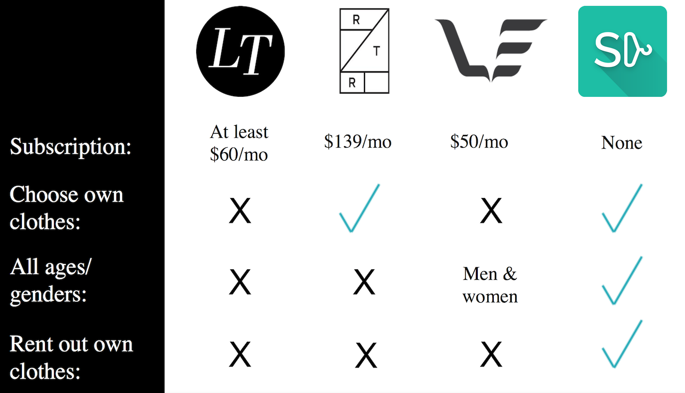
The main difference between these apps is that the users fill out a style
survey and get a clothing package which is picked out by employees.
Although these two are clothing rental services, they are vastly
different from our idea because we rely on the user base to rent clothes
to each other, rather than purchasing the clothes ourselves to rent out
as a service. Rent the Runway is somewhat similar to our idea since the
service allows users to pick out specific clothes to rent; however,
their target user base is geared more towards women in their late 20’s,
as shown by the styles offered and the exclusive female clothing
selection.
Regardless, the competitive analysis gave us insight on
several features that we should integrate into the app like a rating
system, a third party quality control policy and a messaging platform.
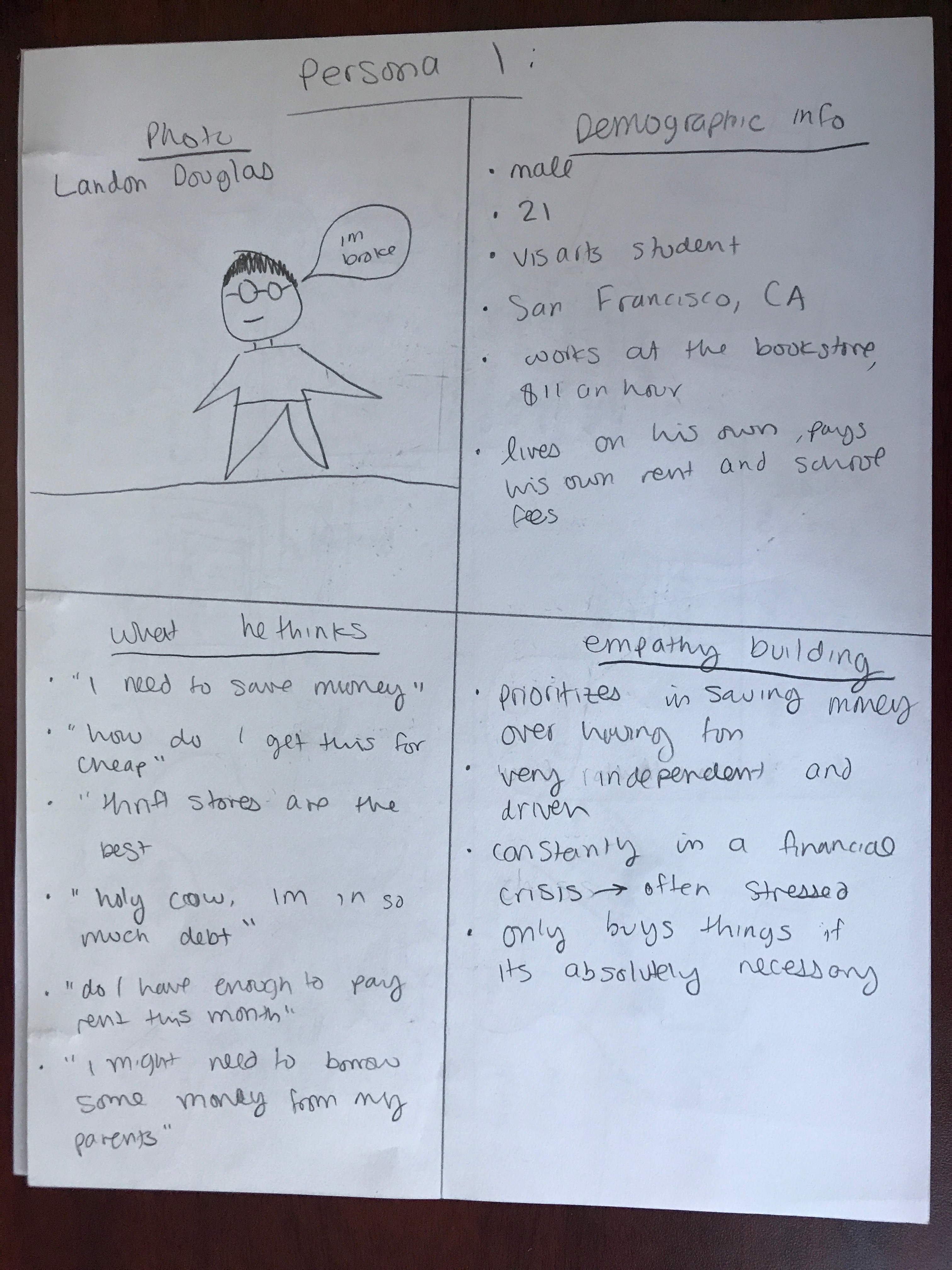
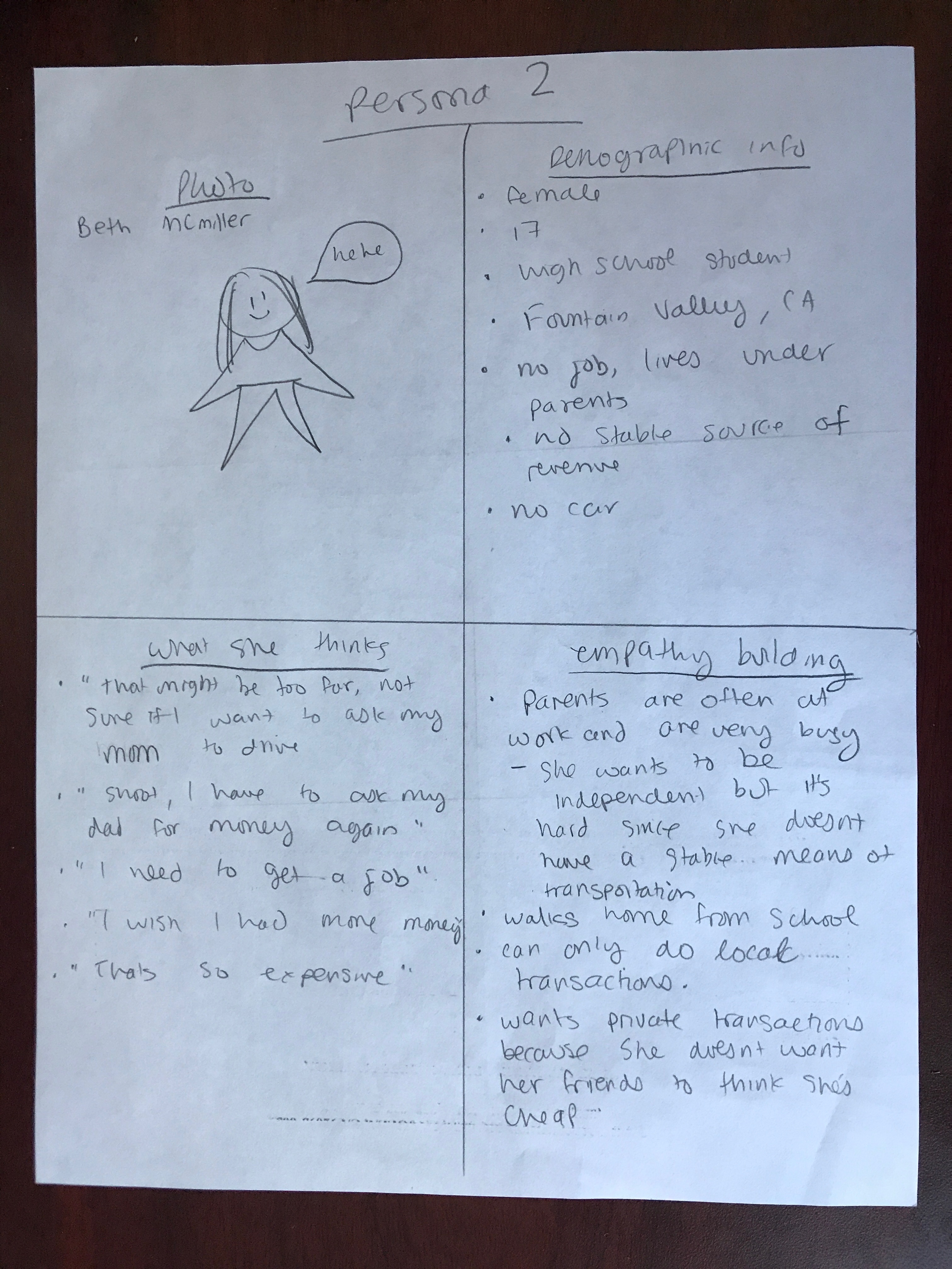
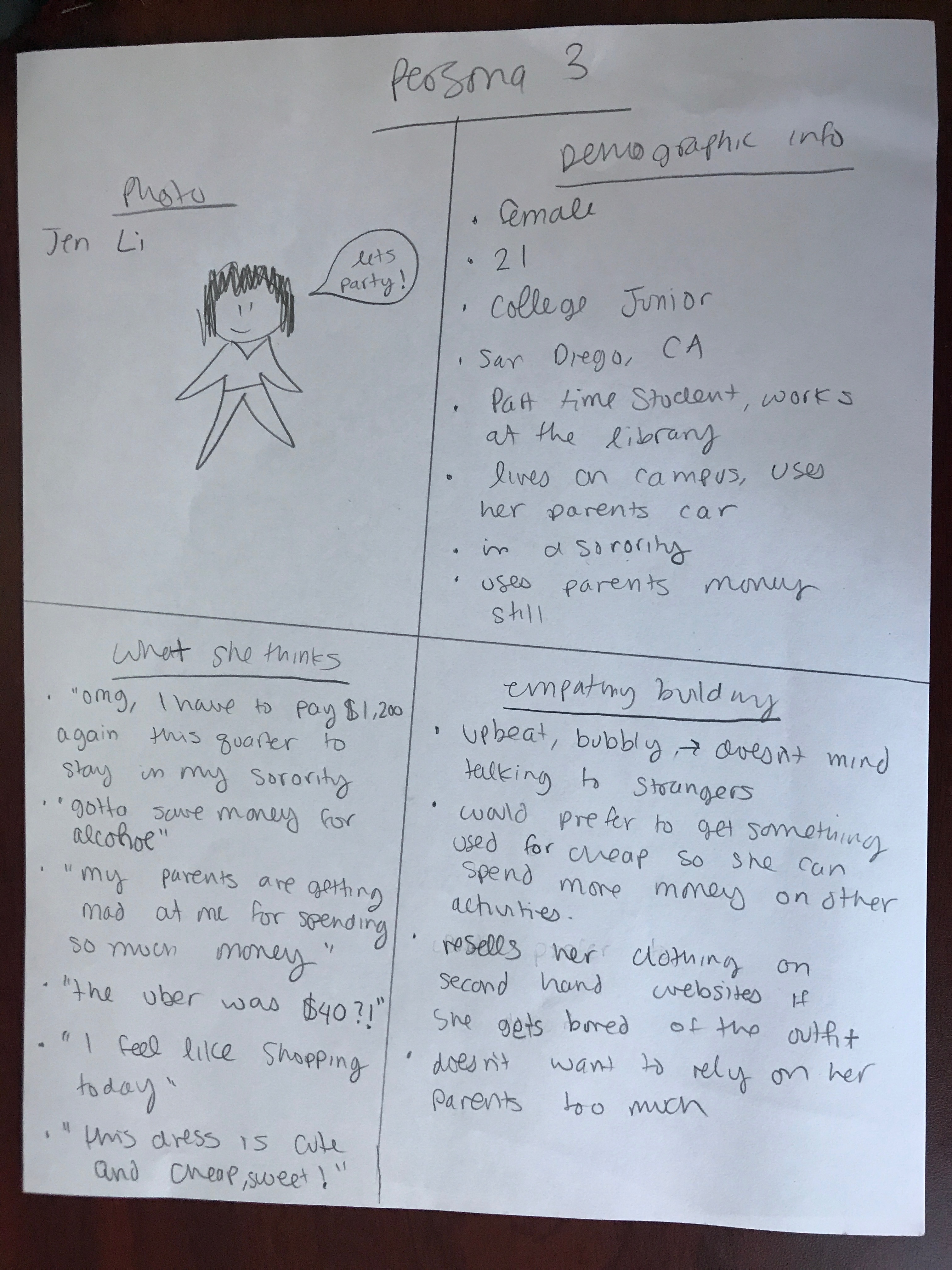
We created the storyboards to help us string together the personas, user stories, and our research findings to develop requirements for our product. This also helps us see a clearer picture on what were being designed and can potentially help us create new design concept.
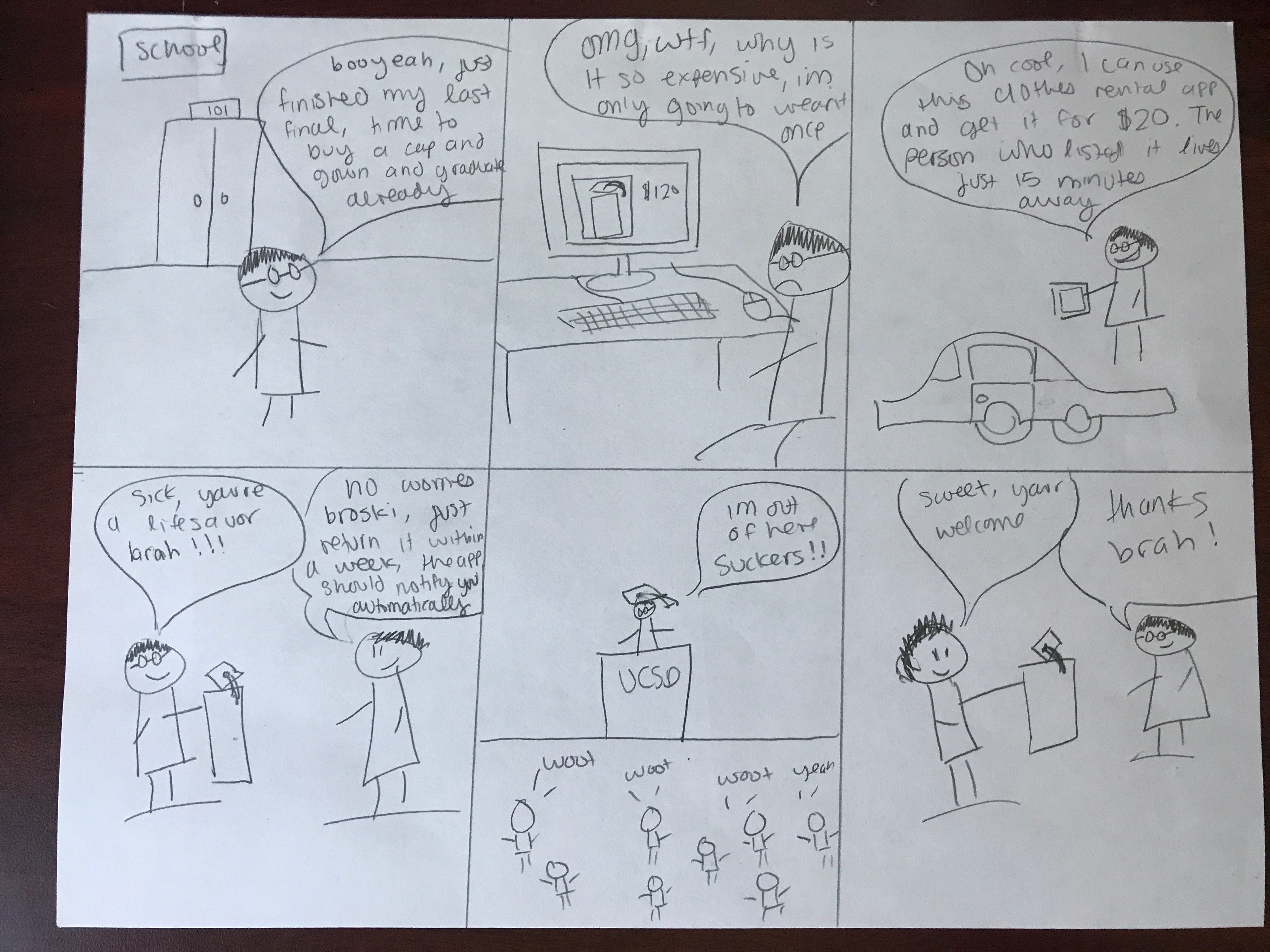
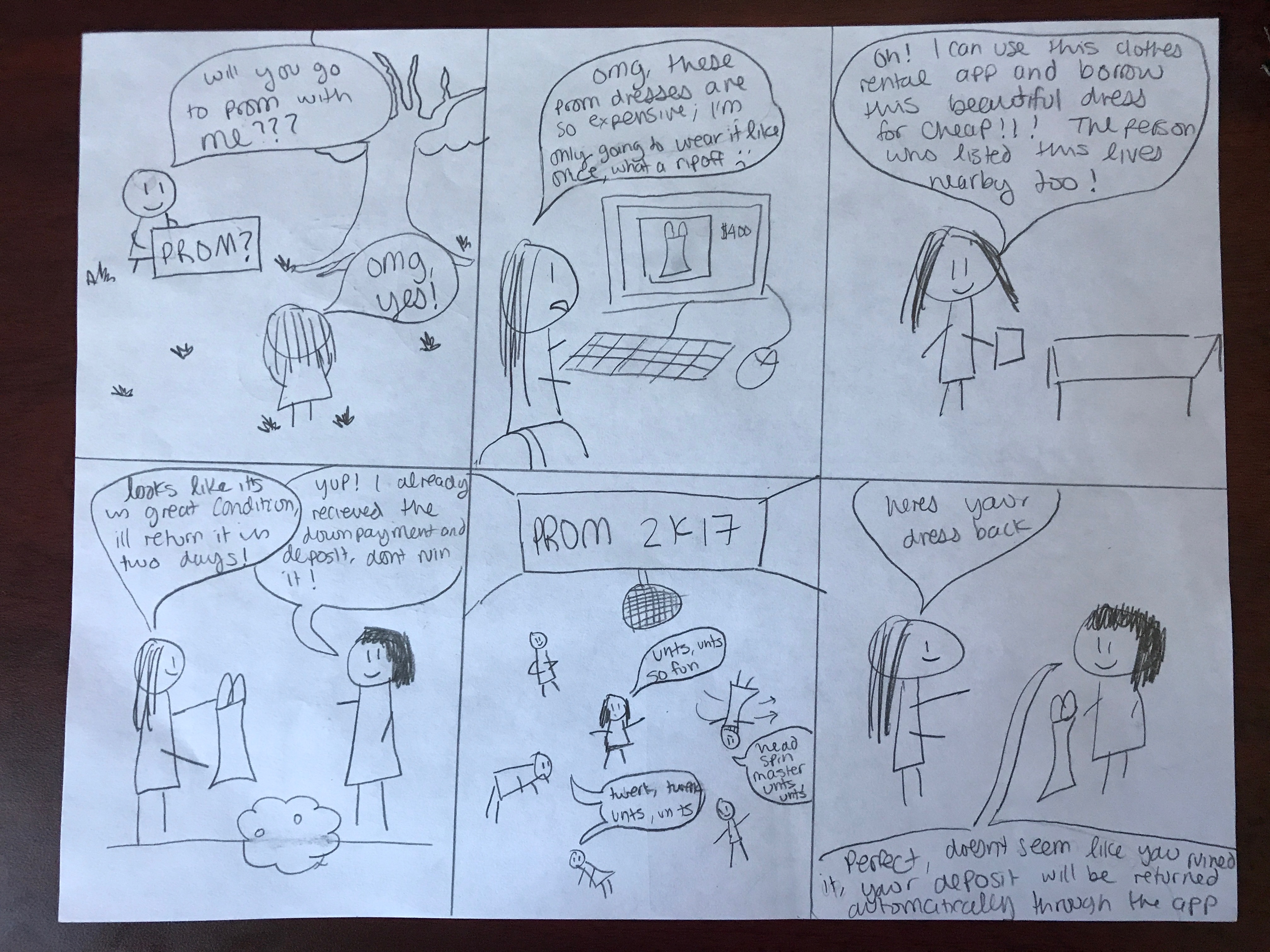
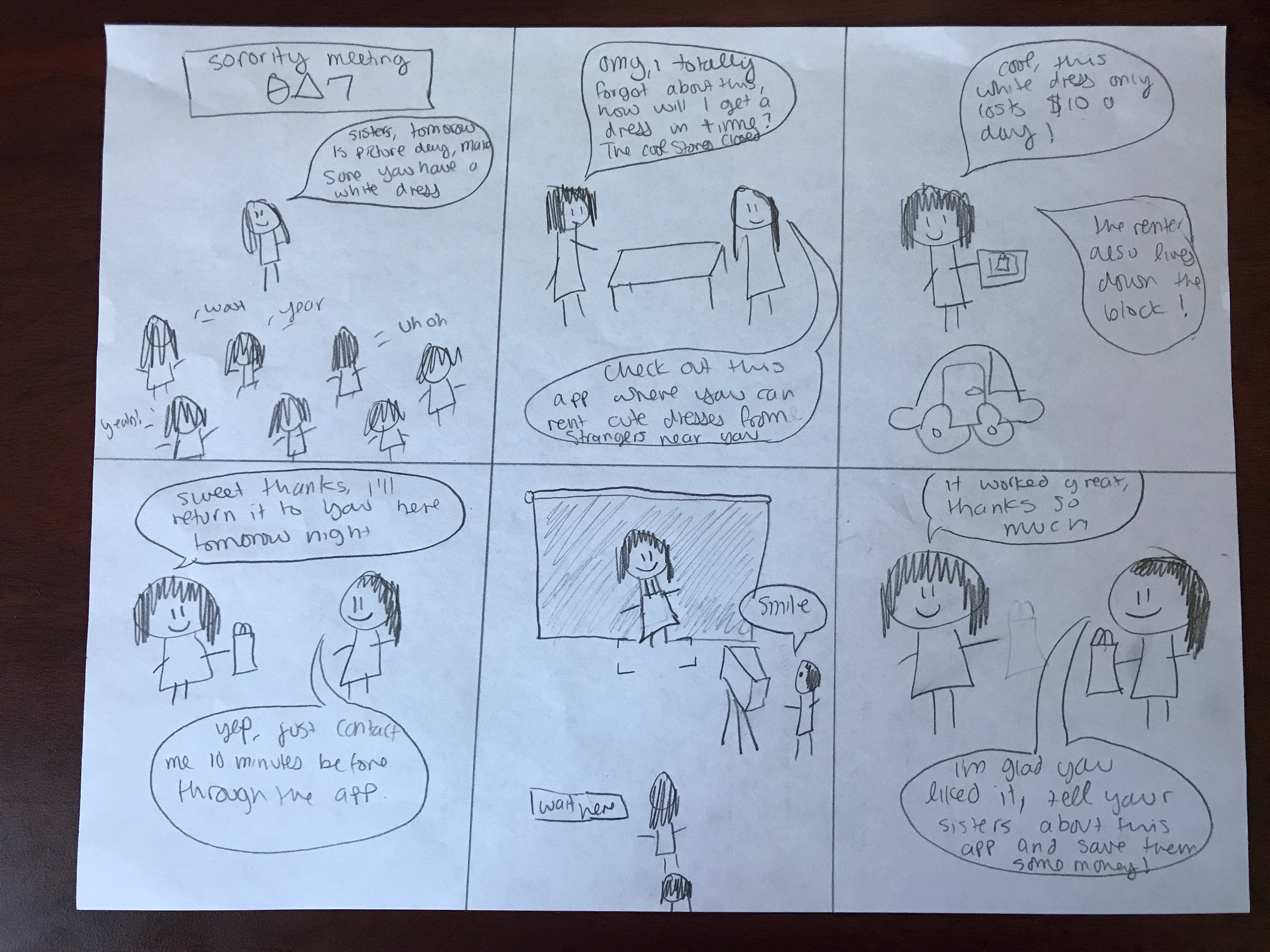


We showed our users the paper prototype and let them interacts by clicking on the buttons. As they are interacting with the page, we show them how it will look like on the app by showing them the other paper prototype that contains the UI. We wanted to make sure that we did not miss any important pages for the app. This also helps us understand whether there is ambiguity and clarity issues on our app.
These were the main feedback that we got from our users:
The feedback showed that users liked the simplicity of the interface, but it lacked features and some pages were overly simplistic. We went ahead to edit some pages which includes a complete redesign of the pages and added some new pages for clarity.
We wanted to perfect the UI before jumping in to creating the digital prototype. We keep improving the look and feel of the app by testing it to more and more people. Slowly we're adding and adjusting some UI elements on our prototype until we feel like it's good enough and, of course, until we don't see any confusion in our users while they are testing the UI.
Our team wanted a logo that is simple but not overly simple. To do so, I combined the use of clear text and bright colors to put in to the logo. I got my icon inspiration from my wardrobe, that is, I see a lot of hangers. So I went ahead and rotate the hangers to make it look like the letter 'd' and combine it with a text. At the end, I added the drop down shadow on the outer icon to have a lifted look and feel as well as creating a sense of material into the logo.


This class refined my skills in UX & UI design. It also broadened my experience in prototyping, vector design, and user testing. Although I didn’t talk about it in this case study, this course also had a concurrent portfolio project where I built this website from scratch. I really appreciate the professor and teacher assistants for helping me debug the many problems that I encountered while constructing this portfolio. I’m extremely pleased with it and I intend to use these newly acquired skills for my future projects. Thanks for reading.
